AZULIK Amazonia

TULUM, MEXICO / 2021
Client: ROTH
/ LOGO / CONCEPT / BRANDING
Implementing the New Paradigm in the deep lush of Amazonia
Volunteer Project & Camp-base in Northern Peru, created by ROTH.
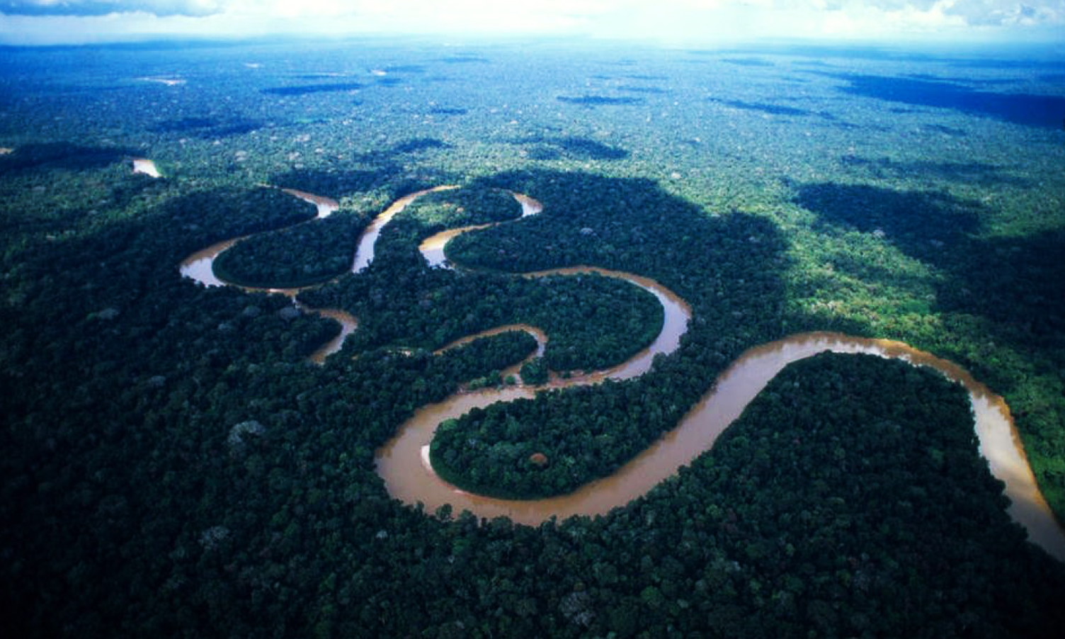
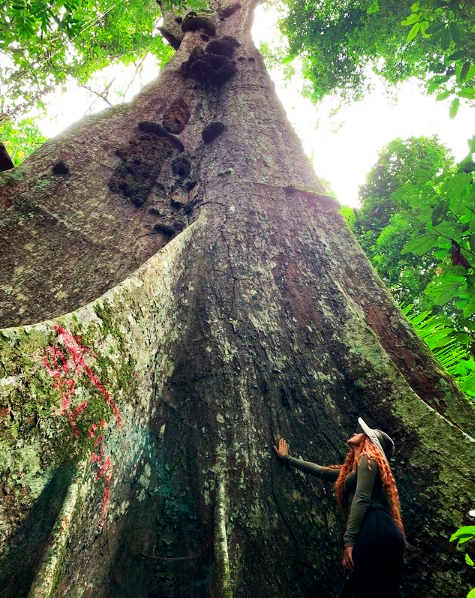
Amazonia is a mega-diverse, complex, and interconnected sacred place with precious richness at all levels. Through Amazonia and the help of our Tribe member volunteers, we are learning and sustaining the wisdom of this lush land as we continue spearheading the new paradigm. Our volunteers live in the deep of the wild jungle to learn from it firsthand.
Our Amazonia initiative is an opportunity to explore new understandings, new actions, and new futures in our effort to carry out the new paradigm. We are in a moment in which we have the opportunity to generate a change. We are dedicated to finding the ways, the forms, and the questions to implement the change as a Tribe. Amazonia is our volunteer project and camp-base in Northern Peru, where we are participating in collective research and learning as well as humanitarian work with local communities.
Credits owned by ROTH®
Photography by Santiago Baravalle
....................................................
 / LOGO CONCEPT
The Reconnection of Water
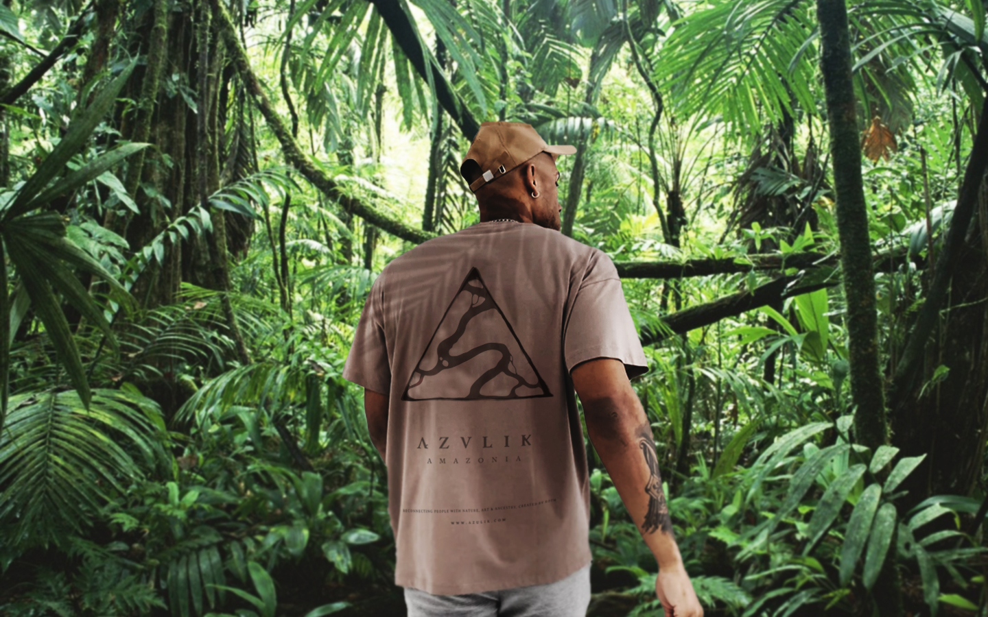
AZULIK Amazonia is the AZULIK sub-brand of the Hotels / Initiatives category. The logo must represent a sub-brand of AZULIK achieved with the combination of the official logo and a sub-name.
A River is never the same
The concept of the icon is based on the representation of the interconnection and reconnection of a river and its channel. By following its own origin and current towards ending or connecting with some other river, sea or lake.
The icon refers to the triangle of the mother brand AZULIK, it is important since it manages to reposition the 3 pillars and philosophy, together with the new concept.
/ ICON CONCEPT


+ Projects ︎︎︎Next